Aaron Parecki

Hi, I'm Aaron, co-founder of IndieWebCamp. I maintain oauth.net, write about OAuth, and am the editor of the W3C Webmention and Micropub specifications, and co-editor of WebSub.
I've been tracking my location since 2008, and write down everything I eat and drink. I've spoken at conferences around the world about owning your data, OAuth, quantified self, and explained why R is a vowel.
-
 IndieWebCamp
Founder
IndieWebCamp
Founder
-
 W3C
Editor
W3C
Editor
-
 W7APK
W7APK
- These are a few of my favorite things.
Backpedal Productions

Building OAuth 2.0 Servers


-
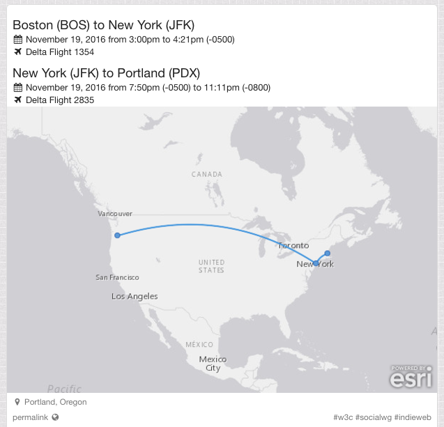
Day 13: Curved Lines for Atlas Static Maps #100DaysOfIndieWeb
Yesterday, Amy was asking if there was a library for drawing curved lines between two points on a map. She wants to use this for her travel posts, which say for example "Tokyo to Boston". We noticed that Facebook draws curved lines when they show a planned trip. Martijn was able to figure out how to reproduce this on Facebook consistently. You have to start by creating a "checkin" post, then add a "traveling to" activity to it. Notice that the line from Portland to Seattle is curved rather than straight, although it doesn't strictly follow a Great Circle line either.

I liked this idea, and realized that my own travel posts would benefit from images as well, so I set to work adding this to the library that I use to generate the maps for my posts. Before, my posts just look like this. Wouldn't this look better with a map?

My static maps are generated using Atlas, a service I wrote for handling all the geo stuff on my website. The static map generation is actually a surprisingly simple chunk of code, which assembles all the necessary map tiles and then draws points and lines on top of them using PHP GD and ImageMagick.
The first step was to figure out how to draw curved lines. There was more to it than I originally anticipated. I knew roughly the shape of the curve I wanted, and after researching a bit, determined that a Quadratic Bézier Curve would give me the shape that I want.

A Quadratic Bézier Curve differs from a standard one in that only one control point (P1 in the image above) is used instead of two. Luckily, the PHP ImageMagick library has a function to draw that curve. If I use a control point at the midpoint of the start and end of each leg, I'll get a nice symmetric curve. I can vary the height of the curve by using a control point farther away from the line connecting the two points. Here's approximately what I'm going for, where A and B are the start and end points of the line segment, and P is the control point.

Given A and B, I can find the mid-point M easily. Half the distance is d, so I know one side of the triangle, and I choose the angle alpha. It's been a long time since I've had to use any trig, so my memory of all this is rusty, but I did remember that it should be possible to find point P given one angle and one side of a right triangle. It took a while to dig up all the identities and formulas for this. Ultimately this stackexchange answer explained things well enough for me to reverse engineer a generic formula out of it.

This means I can now vary the angle alpha to adjust how steep to make the curve. This translates into the following ImageMagick PHP code.
$draw->pathStart();
$draw->pathMoveToAbsolute($A['x'],$A['y']);
$draw->pathCurveToQuadraticBezierAbsolute(
  $P['x'], $P['y'],
  $B['x'], $B['y']
);
$draw->pathFinish();
We start at point A, then move through point P to land at B. With an angle of 25 degrees, this gives a pretty great looking curve!

Once I started running this code for other trips from various points on the globe, I immediately ran into some interesting issues. It turns out these curves look best when the horizontal curves go upwards and the vertical curves go to the right, and when there are multiple hops, the lines must not overlap. Here are some images from my library with curves I'm relatively happy with.


It took quite a bit of trial and error to determine the rules for making these render properly. The main trick is this: If the line is wider than it is tall, then draw the line from left to right. If the line is taller than it is wide, then draw from top to bottom. ("Draw from left to right" means choosing the leftmost point as point A in the equation above.)
This rule ends up with pretty good results in most cases, as you can see above. However there are still a couple of cases I'm not 100% happy with, although I can't quite come up with a rule to fix them so I'm going to leave them as is for now.

I think the curve in the Iceland to Germany hop should be flipped 
Here, the Detroit to Nashville hop should be flipped, I think because the obtuse angle looks wrong. I'm reasonably happy with the results regardless that I'm going to leave it alone for now. If you have any thoughts on fixing it, you're welcome to submit a pull request to Atlas!
If you want to use this yourself, you're welcome to run the Atlas API on your own server, or just copy the code and use it as a library! To generate these curves, pass a parameter bezier=25 into the request when you are generating a line between two points.
Now my itinerary posts look a lot better!
-
Day 12. This started out as a totally unrelated riff, and by the time I was done adding to it, the original riff didn't make any sense so I deleted it. There are actually 4 different kinds of trumpet tracks in this in order to achieve this semi-realistic result. I was on the fence about adding a faint string section in the background and decided against it in the end. I enjoyed playing with the drum section in this one, using silence to emphasize the trumpet solos.
-
Day 12: Whitelist and Blacklist for OwnYourGram import #100DaysOfIndieWeb
Today I added some additional settings to OwnYourGram. You can now configure a whitelist and/or blacklist of keywords to control which of your Instagram posts are imported to your website.

I've been posting my #100DaysOfMusic posts on Instagram and having OwnYourGram post them back to my website, but over the past week I've found some problems with that approach. Instagram videos are limited to 60 seconds, and one of my songs was 90 seconds long. Instagram also runs some pretty heavy compression on the audio, which seems to be optimized for speech, so the music doesn't come through as cleanly as I wanted.
Because of this, what I've been doing is replacing the video on my website after OwnYourGram does the initial import. This workflow ends up being way too complicated, so what I'm going to start doing instead is posting the videos to my website directly. However, I still want to share them on Instagram, but I would end up with OwnYourGram posting another copy of it back to my website.
With the new blacklist setting, now I can blacklist the "#100DaysOfMusic" tag so that OwnYourGram will skip importing those videos. While I was at it, I also added a whitelist in case someone has a use case for that as well. You can use the whitelist and blacklist together to make a rule that imports photos matching a keyword as long as another keyword is not present.
I'd love to hear if you end yup using either of these settings!
-
Day 11. I'm definitely less happy with this one than any others so far, but hey that's what this project is about. Putting stuff out there and not worrying too much about it. #100daysofmusic #100daysproject #the100dayproject
-
Day 11: Simpler fonts #100DaysOfIndieWeb
The other day I read a pretty funny blog post called "10 things I learned making the fastest site in the world". It's a little tongue in cheek, but overall has some good tips. One that caught my attention was the section on using web fonts.
#10 Computers have nice fonts
I’m always torn when it comes to web fonts. They’re a pain, performance-wise. But it’s nice to have nice things.
I gave it a bit of a think-over for this site and came to a stunning realisation in four parts:
- macOS has nice fonts
- Android has nice fonts
- Windows has nice fonts
- iOS has nice fonts
...
If you tell yourself you need the same, custom font on all devices then things have already gone too far and there is no hope for you.
This is followed by a snippet of CSS called "good-enough.css".
body {
    color: #212121;
    font-family: "Helvetica Neue", "Calibri Light", Roboto, sans-serif;
    -webkit-font-smoothing: antialiased;
    -moz-osx-font-smoothing: grayscale;
    letter-spacing: 0.02em;
}
This CSS includes fonts that are available on all the platforms listed, as well as tweaks the font smoothing used in WebKit and OSX.
This has quickly become my favorite default font to use in projects rather than just "sans-serif" or loading a Google Web Font.
I launched this change on my website, so you're likely reading this post in my new font style. Below I've included some screenshots showing the differences between the old and new fonts.
Old Font
This is the default font that ships with the Semantic-UI CSS framework which I use on my site.


The font is called Lato, and it's one of the fonts available via Google Web Fonts, which means you have probably seen "loading fonts.googleapis.com" in the status bar when on my website at some point in the past. It's a nice font, but do I really need this text to look exactly like this? Probably not.
Switching to System Fonts
Here's what it looks like when I apply just the font-family CSS rule so that Helvetica Neue is rendered on OSX.


I think it's perfectly acceptable.
The Finished Product
Adding in the tweaks to font-smoothing, you'll notice a subtle difference in the rendering. Suddenly the text looks a lot crisper!


I'm happy with the look of this font, and also happy that I no longer need to rely on the Google Web Fonts service and make people load that extra HTTP request when viewing my site!
-
Day 10. Mozart is probably rolling in his grave. I took the beginning of Lacrimosa, changed it to 4/4, and added drums and some other non orchestral instruments. This was my first time playing with the East/West Choir "Word Builder" which is a tool where you can type phonetically what you want the choir to sing and it puts it together. This rendition is by no means perfect, but I could get it a lot closer with more time, tuning the precise timings of moving from each consonant to vowel and back. The instrumentals I added are inspired by E.S. Posthumus. #100daysofmusic #100daysproject #the100dayproject
-
I'm doing #100DaysOfIndieWeb! Here's what I finished this week: https://aaronparecki.com/2016/12/30/7/week-in-review
-
Week in Review #100DaysOfIndieWeb
Webmention.io
- Day 3: The avatars for comments/likes/etc that Webmention.io processes will now always be 256 pixels maximum. This avoids showing potentially large images shrunk down when displaying comments.
- Day 10: HTML status pages for webmention.io

Quill
- Day 4: The reply context on the note posting interface will truncate if the post you're replying to is large.
- The content area automatically expands when you type long notes.

OwnYourGram
- Day 5: There is now an interface in OwnYourGram you can use to post your 20 most recent photos again if you need to. This can be helpful when you're initially developing your Micropub endpoint, to test with real data from your Instagram account, and can be used to fill in the gaps if OwnYourGram misses some of your photos for some reason.
- There is also a "disconnect" button you can use to stop OwnYourGram from processing your Instagram account.
- Day 6: OwnYourGram now puts users into different tiers of polling frequency based on how often you post photos. This improves the responsiveness for heavy users, and reduces system load for users who don't post often.

aaronparecki.com
- Day 7: Changed the display of sparklines on my tag pages to be bar charts instead of a line.
- Day 8: Now I can pin posts on tag pages!
- Day 9: Added a Webmention form to the bottom of my posts.


- Day 3: The avatars for comments/likes/etc that Webmention.io processes will now always be 256 pixels maximum. This avoids showing potentially large images shrunk down when displaying comments.


