The future of style
The Future of Style aggregates posts from various blogs that
talk about the development of Cascading Style Sheets (CSS) [not
development with Cascading Style Sheets]. While it is
hosted by the W3C CSS
Working Group, the content of the individual entries represent
only the opinion of their respective authors and does not
reflect the position of the CSS Working Group or the
W3C.
Latest articles
- HTTPS and the Semantic Web/Linked Data •
20 May 2016 05:51 PM
- CSS Dev Conf is a conference about CSS in San
Antonio TX (US… • 20 May 2016 05:30 AM
- CSS Grid Layout – Updated Working Draft •
20 May 2016 02:28 AM
- CSS Box Alignment Level 3 – Updated Working
Draft • 20 May 2016 02:21 AM
- The CSS WG updated the Candidate
Recommendation of CSS Casca… • 19 May 2016 12:00 AM
- The CSS WG updated the Working Draft of CSS
Positioned Layou… • 17 May 2016 12:00 AM
- Protected: Eurovision alternative results
• 15 May 2016 09:02 AM
- The CSS WG updated the Working Draft of CSS
Intrinsic & … • 12 May 2016 12:00 AM
- Video of the Week: Ryan Seddon–Houdini •
06 May 2016 04:18 AM
- Minutes Telecon 2016-05-04 • 04 May 2016
11:54 PM
- Minutes Telecon 2016-04-27 • 27 April
2016 11:18 PM
- Minutes Telecon 2016-04-13 • 13 April
2016 11:58 PM
- Minutes Sydney F2F 2016-02-03 Part I: 2017
F2F Meetings, Scroll-linked Animations, Fill & Stroke on CSS
Text • 12 April 2016 11:25 PM
- Minutes Sydney F2F 2016-02-03 Part II: SVG
Text Issues, CSS Masking, Filters, Gradients & Dithering,
Investigation about JS API for realizing Level of Details,
Transitions and Animations, Matrices • 12 April 2016 11:25
PM
- Minutes Sydney F2F 2016-02-02 Part II:
Behavior of contains:paint and overflow:clip, text-overflow and
resize properties; CSS Text; Exclusions and bidi; Snap Points;
bookmark-level: auto; Sizing • 12 April 2016 10:48 PM
- Minutes Sydney F2F 2016-02-02 Part I: A
report on research into automatic layout, CSS Text, Round
Display • 12 April 2016 10:44 PM
- The CSS WG published the first draft of
Cascading Style Shee… • 12 April 2016 12:00 AM
- Minutes Telecon 2016-04-06 • 06 April
2016 11:08 PM
- (Re)introducing Scroll Magazine • 06
April 2016 09:00 PM
- Minutes Telecon 2016-03-30 • 30 March
2016 11:56 PM
- Minutes Telecon 2016-03-23 • 30 March
2016 11:48 PM
- Minutes Telecon 2016-03-16 • 30 March
2016 11:35 PM
- The CSS WG updated the Working Drafts of CSS
Scroll Snap Poi… • 29 March 2016 12:00 AM
- Historical maps of Europe, 362-830 AD •
25 March 2016 11:37 AM
- Respond Speaker insight: Sara Soueidan •
23 March 2016 01:25 AM
- UniView now supports Unicode 9 beta • 19
March 2016 10:22 PM
- Respond ’16, the full, amazing lineup •
18 March 2016 02:57 AM
- CSSOM and CSSOM View Drafts Updated • 17
March 2016 11:38 AM
- The CSS WG updated the Working Drafts of CSS
Object Model (C… • 17 March 2016 12:00 AM
- Minutes Sydney F2F 2016-02-01 Part II:
Writing Modes, Line Grid, Overflow • 13 March 2016 01:39
PM
- [List of feeds]
HTTPS and the Semantic Web/Linked Data
As we hope you’ve noticed, W3C is increasing the security of its
own Web site and is strongly encouraging everyone to do the same.
I’ve included some details from our systems team below for an
explanation but the key technologies to look into if you’re
interested are Http
Strict Transport Security (HSTS) and Upgrade-Insecure-Requests
(UIR).
Bottom line: we want everyone to use HTTPS and there are smarts
in place on our servers and in many browsers to take care of the
upgrade automatically.
So what of Semantic Web URIs, particularly namespaces like
http://www.w3.org/1999/02/22-rdf-syntax-ns#?
Visit that URI in a modern, secure browser and you’ll be
redirected to
https://www.w3.org/1999/02/22-rdf-syntax-ns#.
Older browsers and, in this context more importantly, other user
agents that do not recognize HSTS and/or UIR will
not be redirected. So you can go on using
http://www.w3.org namespaces without disruption.
This raises a number of questions.
Firstly, is the community agreed that if two URIs differ only in
the scheme (http://, https:// and perhaps whatever comes in future)
then they identify the same resource? We believe that this can only
be asserted by the domain owner. In the specific case of
http://www.w3.org/* we do make that assertion. Note that this does
not necessarily apply to any current or future subdomains of
w3.org.
Secondly, some members of the Semantic Web community have
already moved to HTTPS (it was a key motivator for w3id.org). How steep is the path from where
we are today to moving to a more secure Semantic Web, i.e. one that
habitually uses HTTPS rather than HTTP? Have you/are you
considering upgrading your own software?
Until and if the Semantic Web operates on more secure
connections, we will need to be careful to pass around http URIs –
which is likely to mean remembering to knock off the s when pasting
a URI from your browser.
That’s a royal pain but we’ve looked at various workarounds and
they’re all horrible. For example, we could deliberately redirect
requests to things like our vocabulary namespaces away from the
secure w3.org site to a deliberately less secure sub-domain – gah!
No thanks.
Thirdly, a key feature of the HSTS/UIR landscape is that there
is no need to go back and edit old resources – communication is
carried out using HTTPS without further intervention. Can this be
true for Semantic Web/Linked Data too or should we be considering
more drastic action. For example, editing definitions in turtle
files such as the one at http://www.w3.org/ns/dcat# to
make it explicit that
http://www.w3.org/ns/dcat#Dataset is
owl:equivalentClass to
https://www.w3.org/ns/dcat#Dataset (or even worse,
having to go through and actually duplicate all the definitions
with the different subject).
I really hope point 3 is unnecessary – but I’d like to be
sure it is.
Background
Jose Kahan from W3C’s Systems Team adds
HSTS does the client side upgrade from HTTP to HTTPS for a given
domain. However, that header is only sent when doing an HTTPS
connection. UIR defines a header that, if sent by browser, will
tell the server it prefers using HTTPS and the server will redirect
to HTTPS, then HSTS (through the header in the response) will kick
in. HSTS doesn’t handle the case of mixed-content.
That is the other part that UIR does to complement HSTS: tell the
browser to update URLs of all content associated with a resource to
HTTPS before requesting it.
For browser UAs, if HSTS is
enabled for a domain and you browse a document by typing its URL on
the navigation bar or follow a link to a new document, the request
will be sent as HTTPS, regardless of the URL saying HTTP. If the
document includes a CSS file, javascript, or an image, for example
and that URL is HTTP, the request for those resources will only be
sent as HTTPS if the UA supports UIR.

CSS Dev Conf is a conference about CSS in San Antonio TX
(US…
17 Oct 2016 CSS Dev Conf is a conference
about CSS in San Antonio TX (USA), on 17–19 October. A feature of
this conference is that part of the conference program is
determined by
vote.
CSS Grid Layout – Updated Working Draft
The CSS Working Group has published an updated Working Draft of
CSS Grid Layout Module
Level 1. This module defines a new type of layout manager, the
grid, which makes it extremely easy to specify complex, responsive
2-dimensional layouts for a page or components.
This new draft incorporates a lot of feedback since the previous
draft, including a simplified subgrid proposal, a
much-improved grid
shorthand syntax that accommodates auto-flow grids, and many
bugfixes. Changes since the last Working Draft are listed in the
Changes
section, and a Disposition
of Comments is available.
Please send feedback by either filing an issue in
GitHub or sending mail to the (archived)
public mailing list
[email protected] with the spec code ([css-grid])
and your comment topic in the subject line. (Alternatively, you can
email one of the editors and ask them to forward your comment.)
We do expect to transition this module to Candidate
Recommendation shortly, so any feedback had best be sent ASAP!

CSS Box Alignment Level 3 – Updated Working Draft
The CSS Working Group has published an updated Working Draft of
CSS Box Alignment Level
3. This module defines new features relating to the alignment
of boxes within their containers in the various CSS box layout
models: block layout, table layout, flex layout, and grid
layout.
This draft includes a slew of relatively minor tweaks and
bugfixes, particularly to the baseline-alignment section, plus a
change in the default “safety” of overflow handling. Changes since
the last Working Draft are listed in the Changes
section.
Please send feedback by either filing an issue in
GitHub or sending mail to the (archived)
public mailing list
[email protected] with the spec code ([css-align])
and your comment topic in the subject line. (Alternatively, you can
email one of the editors and ask them to forward your comment.)
We would also welcome the donation of any illustrations or
examples, as this document desperately needs more.

The CSS WG updated the Candidate Recommendation of CSS
Casca…
The CSS WG updated the Working Draft of CSS Positioned
Layou…
Protected: Eurovision alternative results
The CSS WG updated the Working Draft of CSS Intrinsic &
…
Video of the Week: Ryan Seddon–Houdini
Don’t you sometimes wish you could create your own CSS
properties? Not just some syntactic sugar to make life easier like
Sass and other pre-processors, but honest-to-goodness properties,
like new display options, painting your own images
from JavaScript as backgrounds, borders and elsewhere images can be
used, and so on. And all in ways that don’t hugely impact the
browser performance the way for example JavaScript based property
animation does?
Enter a brand new (still very much under development but so cool
we have to talk about it even at this stage) CSS feature,
code-named Houdini (if
you’re not entirely familiar with Harry Houdini, he was a hugely
popular illusionist and escape-artist from the early 20th Century.
And why ‘Houdini’? Because it allows you to escape the current
constraints of CSS (yes, a dad joke)).
There’s a great article going into some detail about Houdini at
our good friends Smashing Magazine from a few weeks back (yep,
it’s still very new), but this is definitely something we feel will
arrive sooner than you might think.
So this week’s video of the week is from a recent post-Respond
“mega meetup” with MelbCSS, Be Responsive and MelbJS, featuring
Ryan Seddon on Houdini.
Like to watch and read more like this? Be the first to score
invitations to our events? Then jump on our once a week mailing
list where we round up the week’s best reading and watching on all
things Web. And you’ll get a complimentary digital copy of our brand new magazine, Scroll.
The post
Video of the Week: Ryan Seddon–Houdini appeared first on
Web
Directions.
Minutes Telecon 2016-05-04
- There was agreement on the mailing list that media queries
should respond to page sizes set in @page, but Florian wanted more
guidance with what direction the proposed text should take. Florian
suggested that he could write the text to allow the property
function similar to @viewport. There was some uncertainty as to if
this was the right approach, though several people were also in
favor of it. Florian will write proposed text including use cases
and bring it back to the group.
- Resolved: Adopt the proposed convention for propdef
tables for shorthands (available
here).
- ‘proximity’ and ‘mandatory’ still need to be renamed in
Snap Points,
but the group didn’t like ‘strict’ and ‘loose’.
- In the naming conversation around snap alignment container,
there were really three items that need to be named:
- a box that has a scrollbar
- the viewport of the scroll container
- the snapping area of the viewport of the scroll container (i.e.
viewport minus scroll-snap-padding)
- Resolved: A div with overflow that’s not visible (A) is
a ‘scroll container’
- Resolved: B (the viewport of the scroll container) is a
scrollport. C (the snapping area of the viewport of the scroll
container) is a snapport.
Full
Minutes

Minutes Telecon 2016-04-27
- Resolved: When a range endpoint falls in the middle of a
grapheme cluster,
Range.getClientRects() should
include the entire grapheme cluster.
- gregwhitworth asked for updates on browsers for their status on
the control characters change resolved in Sydney in 2015.
- Safari hasn’t begun implementation
- No one on the call could speak for the Chrome team.
- The conversation around
viewport-fit for setting
the viewport in the non-rectangular display will be postponed to
the F2F where a whiteboard is available.
- The terminology will also need to be decided on to make the
concepts clearer.
- The ‘auto’ value of
viewport-fit as written in the
spec wouldn’t be useful. There was wide support for an ‘auto’ value
that says do something between contain and cover that’s smart if
you want to or just do contain. This would allow UAs to innovate in
this new space.
- Changing the initial value of
polar-anchor to
‘auto’ brought up two different models of how
polar-anchor should be used. There wasn’t enough time
to decide between the two, so the conversation will continue either
on the next telecon or the F2F.
-
- Either model would be fine with the initial value being
‘center’ so that is likely to stay the same no matter the result of
the conversation.
Full
Minutes

Minutes Telecon 2016-04-13
- The test submission process is being reviewed in hopes of
making the tests more useful to more people.
- The discussion began around where on the spectrum from the
current metadata status and no metadata should the working group
land.
- It was expressed that the first step should be remove the
pieces everyone agrees should be removed and see how much progress
can be made.
- Tests should be accepted if they contain the important
metadata, even if some of the styling is off with a request to fix
the problems on the next bug.
- From there, the conversation moved to the build system being
another thing obstructing tests.
- There was general agreement that the build system as it stands
now isn’t needed, though there will still need to be metadata left
in to get which tests apply to which spec.
- gsnedders will do the work to remove the build system and see
what progress that creates on testing.
- Discussion on testing will continue on the mailing list.
- Resolved: Add
viewport-fit: contain to
Round
Display spec
- The description of the
viewport-fit property will
need to be clear about the order it occurs in with other
properties.
- The group liked the idea of having an additional attribute
returning shape of display, however this information isn’t
currently exposed to the browser.
- Until the device shape information is available, Florian will
continue working on the media feature he is building to return if a
device is round.
- Bert will continue looking through the errata of CSS 2.2 for test coverage and
report back to the group once he’s done.
- Resolved: Accept grid
issue 26; adopt the language in option B on this
e-mail.
Full
Minutes

Minutes Sydney F2F 2016-02-03 Part I: 2017 F2F Meetings,
Scroll-linked Animations, Fill & Stroke on CSS Text
2017 F2F Meetings
- All possibilities were tentative, but the proposals were:
- January or February will be US or Europe
- Spring 2017 Japan
- Summer 2017 possibly TPAC, depending on TPAC’s timing
Full
Minutes
Scroll-linked Animations
- Due to increased interest, the group revisited a demo that dino
gave back in 2014 on how to handle scroll-linked animations.
- In the time since the demo, there has been in increase in usage
of scroll-linked animations as well as the Houdini effort which may
make it easier to support use cases.
- As an example, exact pull-to-refresh behavior is likely out of
scope, but it can be made easier.
- There were several different aspects that need to be addressed
in order to spec this.
- Should have triggers be pre-transform.
- Anchor points need to be carefully defined in order to prevent
undesirable behavior.
- This may generally have performance issues but, like custom
layout, authors will work out how to use it performantly.
- Parallax triggered animations will need to be supported.
- The group went through a list of scrolling use cases shane had
prepared (available
here)
- Dino will take his original e-mail and turn it into an
explainer document.
Full
Minutes || Spec Referenced
Fill & Stroke on CSS Text
Minutes Sydney F2F 2016-02-03 Part II: SVG Text Issues, CSS
Masking, Filters, Gradients & Dithering, Investigation about JS
API for realizing Level of Details, Transitions and Animations,
Matrices
SVG Text Issues
- The group went through a list of issues and problems that Tav
has documented here.
- Discussed using exclusions to help handle SVG shapes
- It was noted that shape-inside doesn’t have an equivalent
functionality to wrap-flow (which says which side of the shape to
fill); this is needed to handle filling concave shapes
- Discussed ideas for sequentially filling shapes
- Need to clarify that line boxes are fitted to non-rectangular
shapes by requiring zero intersection.
- Middle (half of the x height) and Alignment (synonym for text
top and text bottom) baselines may be useful to add to CSS Inline.
- It may be preferable to have the baseline table reset when the
baseline font changes – this would be a behavior change from SVG
1.1.orientation.
- A decision on default values for mathematical values will wait
for more data.
Full
Minutes
CSS Masking
- Resolved: Change ‘auto’ value of mask-mode to
‘match-source’.
- birtles will investigate dropping mask-type. If it’s not
dropped, he will update the normative text.
Full
Minutes || Spec Referenced
Filters
- The authors will keep moving the spec toward CR.
- Tav presented a new filter primitive he’d like added to level
2; dino agreed it was interesting and will look into adding it to
the spec.
Full
Minutes || Spec
Referenced
Gradients & Dithering
- Either AmeliaBR or Tav will create a proposal to either offer
author control or spec guidance for browsers on dithering.
Full
Minutes
Investigation about JS API for realizing Level of Details
- stakagi presented some very detailed work he had done (Available
here)
- His wiki will be linked to from the spec as a list of things
the spec needs to address.
Full
Minutes
Transitions and Animations
- Both specs are being worked on and dbaron expressed a desire to
have help in making progress.
Full
Minutes
Matrices
- zcorpan requested review of the edits he made (Available here) in
the WHATWG geometry spec.
Full
Minutes

Minutes Sydney F2F 2016-02-02 Part II: Behavior of
contains:paint and overflow:clip, text-overflow and resize
properties; CSS Text; Exclusions and bidi; Snap Points;
bookmark-level: auto; Sizing
Behavior of contains:paint and
overflow:clip, text-overflow and
resize properties
- Resolved: Remove any mention of
overflow:clip from the containment spec
and change section 3.3 to define that clipping happens (just not by
affecting value of ‘overflow’)
Full
Minutes || Spec Referenced
CSS Text
- Resolved: In order to prevent overflow or wrapping of
invisible white space, spaces at the end of a line must either be
visually collapsed to fit within the line or must hang outside the
line (as in hanging punctuation)
- Resolved: Add
word-break: break-spaces
- Resolved: Drop
pre-wrap-auto
- Resolved:
text-wrap: balance evaluation
works off of remaining space in the line, not average line
length.
- The changes to text-decoration ( listed in this e-mail)
need to be explained further before a resolution can be
reached.
- Resolved: Add
word-break: break-word to
spec if Edge/Firefox find it critical enough to Web compat to
implement it.
Full
Minutes || Spec
Referenced
Exclusions and bidi
- Resolved: When a line is split by an exclusion, each
side is its own line box for the purposes of bidi algorithm (i.e.
they are effectively separated by a soft line wrap). Which line box
is first depends on the block’s directionality.
Full
Minutes || Spec Referenced
Snap Points
- Resolved: The only pseudo elements that snap points
apply to are
::before/::after but add a
note that suggest there “might” be a future pseudos that can
support snap points.
- There needs to be more use cases before deciding how to behave
with snapping to unreachable elements
- Still no decision on renaming proximity and mandatory. Current
suggestions are near|always, force|allow, force|proximity,
force|near or keep the original names.
- Resolved: Defer 2D snap to the next module level of snap
points
Full
Minutes || Spec Referenced
bookmark-level: auto
bookmark-level will stay the same in CSS Break.
Full
Minutes || Spec
Referenced
Sizing
- gregwhitworth will investigate if min-width on tables is
possible.
Full
Minutes || Spec
Referenced

Minutes Sydney F2F 2016-02-02 Part I: A report on research into
automatic layout, CSS Text, Round Display
A report on research into automatic layout
- Bert had visited groups from Monash University and YesLogic to
hear about the work they’re doing creating algorithms in constraint
spaces. Their algorithms not only take the known constraints, but
can recompute as they get additional information.
- Uses for constraint solving include footnotes, sidenotes,
indexing, table layout, and line breaking. It was mentioned some of
this could be hooked in via Houdini.
- There was interest in working more with both groups, especially
the expertise from the YesLogic folks. Specifically it was thought
they would have useful feedback on the Grid spec.
Full
Minutes
CSS Text
- There was agreement that there is a strong use case to solve
for aligning to a particular character in table columns.
- Resolved: left-align the alignment characters.
Full
Minutes || Spec
Referenced
Round Display
- Resolved: Add radial-gradient
side keywords
to polar-distance. Mark issue for how to get e.g. from top left
corner, 100% of shortest side.
- There was some uncertainty about how ‘contain’ should behave in
relation to the previous resolution and in general. However, it was
decided that decisions on if ‘contain’ should be a default behavior
should wait on a final definition.
- The existing proposals for addressing polar positioning and
abspos were discussed, but there were still unanswered questions.
- An outstanding concern that the mental model for this was the
opposite of the mental model for the rest of CSS alignment to
achieve the desired effect.
- Resolved: Make the following changes:
- Remove ‘polar’ value of ‘position’. Polar positioning applies
to absolute/fixed/static/sticky/ relative positioned elements.
- Remove ‘auto’ value of ‘polar-distance’. Initial value is
0.
- Add ‘auto’ value to ‘polar-origin’. This means find the origin
using normal rules for absolute/fixed/static/sticky/relative
positioning.
- Make ‘auto’ initial value of ‘polar-origin’.
- Add an open issue as to whether top/right/bottom/left
properties are ignored or interpreted somehow when ‘polar-origin’
is not ‘auto’.
- Note: polar-origin doesn’t apply to relatively-positioned
elements. (Or mark an issue for making it apply somehow).
- Joone presented a proposal for supporting 3d transforms in
round display. However, there were two major issues with this
proposal:
- Transforms aren’t a positioning system. This proposal presumes
that they are.
- Need use cases for what 3D polar coordinates.
- However, there was agreement that it might be interesting to
add functions for using polar-positioning-like syntax as an
alternate way to express existing transforms.
- The ability to support scrolling on a round display would best
come from some of the scrolling work being done in Houdini.
- Since most pages are not designed for round displays, browsers
on such devices simulate a rectangular viewport by designating a
fully-visible area of the display. For pages that are prepared to
handle the constraints of working with a round display, it was
suggested to add an @viewport switch for authors to opt into the
full viewport.
- Resolved: Publish new WD of Round Display,
with polar positioning resolution incorporated (@viewport for next
publication okay)
- The discussion from Sapporo about device-radius was revisited;
originally it had been concluded that the query would no longer
return a radius, but instead return if you’re visible or not.
- There was concern from LG about complexity and
implementability.
- There was a suggestion that a qualitative query for “roundish”
vs “squarish” would be useful, regardless.
- Florian will write up a proposal for this new media query.
Full
Minutes || Spec
Referenced

The CSS WG published the first draft of Cascading Style
Shee…
Minutes Telecon 2016-04-06
- Everyone was reminded to add their information to the wiki if
they’re coming to the F2F and book their travel if they haven’t
already.
overflow-block and overflow-inline
will be combined into overflow with properties to
specify inline and block direction. fantasai will write up proposed
text for the new properties.- Resolved: Add
infinite value to resolution
media query.
- Florian will write up a proposal for a raster media query.
- There wasn’t much desire to add
grid-template
back, but there wasn’t much objection either. fantasai will focus
on making the grid shorthand more robust and solicit more author
feedback.
- Resolved: Publish Sizing
- Everyone was actioned to review the entire Flexbox
DoC. The items that need the most attention are issue #3 and an
additional paragraph added to order accessibility to address
concerns from the accessibility working group.
- Resolved: Accept TabAtkins proposal for
calc serialization and add a note that there remains a
concern about editors getting access to the bare string.
- Everyone was asked to please contribute to the email
thread on the test suite.
- fantasai introduced a wiki compiled by
Nick Guarino listing all resolutions and actions regarding each
spec.
Full
Minutes

(Re)introducing Scroll Magazine
tldr; we’ve relaunched Scroll Magazine, featuring profiles and
interviews, indepth articles, and more. Read on for more details,
or get
yourself a digital copy of our first edition now.
I came to the Web in its early days somewhat by accident.
I was developing a hypertext system, Palimpsest (yes,
ironically, a competitor of the Web, in a sense), and the Web it
seemed, for all its shortcomings as hypertext, represented a new
way for software publishers to distribute their applications,
compared to the traditional model of packaged software sold in
stores. So we built a site, with screen shots and feature lists,
provided our software for download, and then wondered how on earth
we could get people to find it. We hit on an approach which is now
known as content marketing, providing great resources to help
people find and work with what was excitingly called ‘etext’ back
in the early 90s. Of course, to build our site we needed to learn
HTML, and later CSS, and along that journey we realised that there
weren’t particularly good tools for working with CSS, then still in
its earliest days, nor much to help you learn, deal with browser
quirks, and otherwise master Web development. And so I built one of
the earliest CSS editors, Style Master, and in keeping with our
marketing strategy, a whole raft of online courses and resources,
which led to my involvement in the early Web Standards Project “CSS
Samurai”, and to the original css-discuss mailing list, which we
helped start with Eric Meyer, among other initiatives to help
people become better web designers.

A few years later, again largely without a lot of long term
thinking, we founded what became Web Directions, an event that
predates – and provided a blueprint for – almost all the
conferences for Web designers and developers around the world. At
Web Directions, we’ve often featured speakers right at the
beginning of their careers who have gone on to become among our
industry’s most highly respected experts, and have seen the launch
of incredibly influential ideas like OOCSS (Web Directions North
2009) and “The New Aesthetic” (Web Directions South 2012). I don’t
list these in many ways happy accidents to blow our trumpet here at
Web Directions but, among other things, to point out there is no
master plan; rather, a series of inspirations that, to be honest,
we often didn’t realise the value of and on more than one occasion
abandoned before the idea had the opportunity to really come to
fruition. One of the ideas we abandoned that perhaps we should have
stuck with a little longer at is (either literally or figuratively)
in your hands right now: Scroll. The thinking behind Scroll was,
and is, akin to how we think about everything we do at Web
Directions. How can we do what we do differently, better? What are
we doing ritualistically, simply because we’ve always done it like
this, or because it’s always been done this way? Scroll started by
us asking ourselves, “What is the point of a program at an event?”
The bios you read are all online (and in an age of ubiquitous
mobile much more readily accessible there than on paper).
The session descriptions are, as well. All the relevant
information about the event is on the attendee’s lanyard, or just a
link away on their phone. So why are we going to the effort and
expense of designing something essentially useless? Something that
wastes trees? But what if we could create something of real and
lasting value? That captured the ideas that are at the heart of our
event, and let people learn more about the speakers they’ve seen
and their thinking? Something that can be shared with colleagues
and peers, and which would also take some of the value of an event
out far beyond the audience in the room? That’s our ambition with
Scroll. We’ve interviewed some of our amazing speakers and tried to
get behind their thinking, to their motivations and inspirations.
And we’ve tapped some of the speakers to share some of their ideas
and techniques more deeply in print, just for this magazine. As I
write this, Ricky Onsman, who has literally been to more of our
events than anyone, and who has recently – to our great good
fortune – come on board as editor for Scroll and all of the content
at Web Directions, is ridiculously hard at work racing to complete
this first (or third) edition, and so I’m waiting, excited, though
a little anxiously, to see how it turns out. But we’re definitely
going to stick the course this time, and there’ll be editions of
Scroll associated with all our major upcoming events. I hope you
enjoy it. Let us know what you think!
The post
(Re)introducing Scroll Magazine appeared first on Web
Directions.
Minutes Telecon 2016-03-23
- The Selectors section of CSSOM will be on next week’s
agenda and everyone should review it in advance.
- Tentatively the group decided to combine identical units and
resolve all numeric and multiplication and division by numbers when
discussing
calc simplification for serializing
specified values. On next week’s call this will be resolved
formally after implementors have had time to speak to the
appropriate developers.
- Everyone accepted the rewrite of selectors grammer in terms of
the value definition syntax and TabAtkins will add a note warning
that if this is inconsistent with previous grammar, please send an
issue because it’s probably wrong.
- Resolved: Accept
this change to the ch unit definition.
- Resolved: Accept change for issue #5 of Values and Unit 3
- Resolved: Add edits to 2015 snapshot and then
republish.
- Resolved: Start an ED for 2016 snapshot.
- Resolved: shorten minimum/maximum to min/max in exclusions
values
- Resolved: Remove the on-demand value from hover.
- Resolved: Move light-level to the next level of Media Queries
Full
Minutes

Minutes Telecon 2016-03-16
- There will be room for everyone on every day at the May F2F
thanks to the efforts of Ojan and Shane. The Houdini group needs to
decide if and when they’ll need room at TPAC.
- Resolved: Publish new WD of CSS Snap Points
- Step-sizing received favor as a new name for Snap Size.
- Several implementors hadn’t had time to review the spec. Though
they were interested in solving the problem space, they weren’t
prepared to affirm that this ED is the direction they believe the
group should go to solve it. Implementors were given another week
to review the spec in hopes of being able to resolve.
- Resolved: Republish 2015 Snap Shot with
Will Change
added.
- TabAtkins will write up a proposal for checkbox and radio
buttons for next week detailing his thoughts while everyone else
reviews the e-mails.
- Resolved: Allow
calc to be nested.
- Resolved: Drop
calc from nested
calc and serialize it as parentheses.
calc simplification for serializing specified
values will continue on the mailing list and be on next week’s
agenda if needed.
Full
Minutes

The CSS WG updated the Working Drafts of CSS Scroll Snap
Poi…
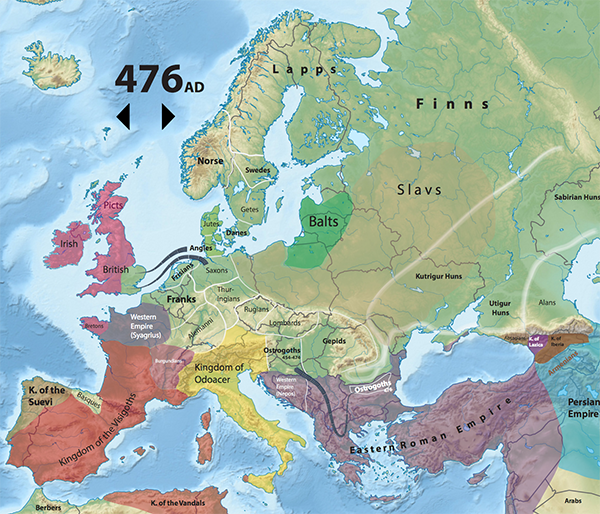
Historical maps of Europe, 362-830 AD
>> See the
chronology
>> See the
maps
This blog post introduces the first of a set of historical maps
of Europe that can be displayed at the same scale so that you can
compare political or ethnographic boundaries from one time to the
next. The first set covers the period from 362 AD to 830 AD.
A key aim here is to allow you to switch from map to map and see
how boundaries evolve across an unchanging background.
The information in the maps is derived mostly from information
in Colin McEvedy’s excellent series of books, in particular (so
far) The New Penguin Atlas of Medieval History, but
also sometimes brings in information from the Times History
of Europe. Boundaries are approximate for a number of
reasons: first, in the earlier times especially, the borders were
only approximate anyway, second, I have deduced the boundary
information from small-scale maps and (so far) only a little
additional research, third, the sources sometimes differ about
where boundaries lay. I hope to refine the data during future
research, in the meantime take this information as grosso
modo.
The link below the picture takes you to a chronological summary
of events that lie behind the changes in the maps. Click on the
large dates to open maps in a separate window. (Note that all maps
will open in that window, and you may have to ensure that it isn’t
hidden behind the chronology page.)
The background to the SVG overlay is a map that shows relief and
rivers, as well as modern country boundaries (the dark lines).
These were things which, as good as McEvedy’s maps were, I was
always missing in order to get useful reference points. Since the
outlines and text are created in SVG, you can zoom in to see
details.
This is just the first stage, and the maps are still largely
first drafts. The plan is to refine the details for existing maps
and add many more. So far we only deal with Europe. In the future
I’d like to deal with other places, if I can find sources.
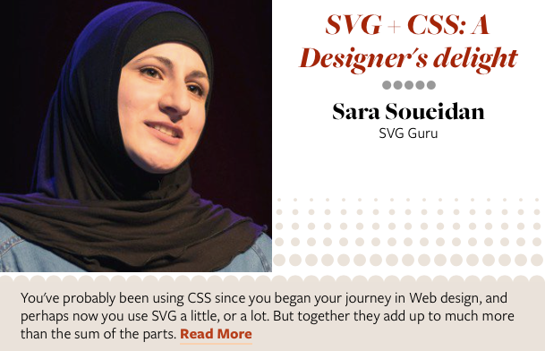
Respond Speaker insight: Sara Soueidan
As we ramp up for Respond, our Web Design
focussed conference, taking place in Sydney and Melbourne next
month (we’ve still got some tickets, and
really significant savings for
freelancers and those who work at Not for Profit organisations)
we’ll be giving you a little insight into some of our speakers.
First up, Sara Soueidan has in the last couple of years really
made a name for herself focussing particularly, but not exclusively
on SVG. At Respond she’ll be talking about the combination of SVG
and CSS, and how together these make for incredibly powerful
expressive design tools, but we also wanted to learn a little more
about what makes Sara tick. Among other things we asked her to
describe the first time she gave a presentation on a web topic.
Oh, that was a fantastically scary time!! It was so exciting but
also so intimidating that I had a moment on stage where I forgot
the particular word that I wanted to say and ended up with a
thought in my head that said “What are you doing here?! Just get
off the stage and go sit back at the table”. Ha ha. It was the
first time I ever spoke in English continuously for more than 30
minutes, so it wasn’t easy and I forgot quite a lot of words on
stage, but one of them was the worst, so the idea crossed my mind
that I should just walk off.
But then I remembered a tip my friend Bruce Lawson gave me via
Twitter right before I got on stage: ‘Just breathe. And keep
going.’ So I literally did that: I took a deep breath, rephrased
what I was going to say and just kept going. By the time I got to
the last section I couldn’t believe it, so I ended up saying ìI
can’t believe I got to the last section’ … out loud … to the
audience!
After the talk, I felt absolutely nothing. It was like I hadn’t
even given a talk. You know how you feel numb after a dentist’s
visit and only start feeling the pain after the pain-killer effect
goes away? Thatís exactly how I felt. For about an hour, I felt
like I hadn’t even been on stage at all. It was the fantastic
feedback I got from the super nice attendees after the talk that
sort of ‘woke me up’ from my trance, and that’s when I realised I
must have done a fairly good job.
I hated watching myself speak and said I’d never speak again
after watching the video because I was too embarrassed. But, well,
you get over it after a while, and the excitement of being on stage
sucked me back in just four months after the first talk, and I’ve
kept going ever since.
I know Sara will be amazing, and like many of our sessions,
worth the price of admission alone. Come and see her, along with a
fantastic array
of local and international speakers.
The post
Respond Speaker insight: Sara Soueidan appeared first on
Web
Directions.
UniView now supports Unicode 9 beta
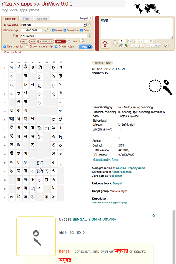
>> Use the
picker
UniView now supports the characters introduced for the beta
version of Unicode 9. Any changes made during the beta period will
be added when Unicode 9 is officially released. (Images are not
available for the Tangut additions, but the character information
is available.)
It also brings in notes for individual characters where those
notes exist, if Show notes is selected. These notes are not
authoritative, but are provided in case they prove useful.
A new icon was added below the text area to add commas between
each character in the text area.
Links to the help page that used to appear on mousing over a
control have been removed. Instead there is a noticeable, blue link
to the help page, and the help page has been reorganised and uses
image maps so that it is easier to find information. The
reorganisation puts more emphasis on learning by exploration,
rather than learning by reading.
Various tweaks were made to the user interface.
Respond ’16, the full, amazing lineup
Earlier this week we announced the complete lineup for our Web design focussed
conference Respond, featuring a truly stellar
lineup you’d be hard pressed to find anywhere in the World,
fresh from such events as An Event Apart, and Smashing
Conference, as well as wonderful locals, some who’ve spoken
all over the world, others we’ve only recently unearthed. We’ve
worked hard to bring together this diverse lineup.
- Ethan Marcotte will cover design patterns,
processes and practices for the responsive age
- Jen Simmons will look in depth at the new CSS
layout technologies like Flexbox, Grid, Shapes, Multicolumn and
Viewport Units to create amazing page layouts
- Sara Soueidan, one of the world’s
leading SVG experts will show how the combination of SVG and CSS
brings extraordinary design capabilities to every browser.
- Karen McGrane will show how adaptive content
supports targeting content to device type—and why that’s rarely
necessary
- Rachel Ilan Simpson on how we can design for
security without sacrificing usability. I honestly think this
session by itself makes it worth attending
- Russ Weakley will show us how to make our
shiny new Web applications accessible
- In an intensive in-depth session we look at a tale of two
redesigns. While Fairfax have completely redesigned and rebuilt
their flagship publications, The Sydney Morning Herald and The
Age (both in beta), online retailers Kogan went the other way,
incrementally redesigning from a split mdot/desktop arrangement to
a responsive solution. We hear from designers on each project on
what they learned, and how it went. I feel this will be one of the
most valuable sessions we’ve ever had at any of our events.
- HTTP2 isn’t coming, it’s here. Web Directions has just switched
over. Peter Wilson will look at why and how to transition, and how
to keep performance up as you do. Another vital session.
Then there are our focused sessions, where in 20 minutes we
really dig deeply into a topic of importance.
- Michael Mifsud will look at CSS Variables. No,
not the ones you’re probably familiar with from Sass or other
preprocessors, but CSS Variables in the browser.
- Jessica Edwards creates mobile interactive
advertisements day in day out, and needs to create the most
engaging, high performance, low bandwidth experiences possible.
Learn how she does it with a range of new CSS features like
Filters, Blend modes and Gradients that you can use. Today.
- You might be surprised at how adaptive typography can be to the
user’s screen size and resolution these days, if you use the right
units. Learn all about responsive type from Craig
Sharkie
- Images still present one the most significant performance
challenge for any site, indeed the responsive landscape only makes
the challenges of delivering images more difficult. But the element
is here to save us. Learn how from Matthew
Kairys.
- And by no means least, the legendary Kevin
Yank uncovers some of CSS best-kept secrets, with a range
of selectors you may not know even exist, as well as a glimpse into
the future.
The post
Respond ’16, the full, amazing lineup appeared first on Web
Directions.
CSSOM and CSSOM View Drafts Updated
The CSS Working Group has published updated Working Drafts of
CSSOM and CSSOM View. The CSSOM
specification defines APIs for Media Queries, Selectors, CSS. The
CSSOM View Module defines APIs for reading and manipulating the
layout, scrolling, window size and position, etc.
Some APIs in CSSOM that have not been widely implemented have
been removed; alternative stylesheet APIs, pseudo(),
cascadedStyle, etc. In CSSOM View a new API
document.scrollingElement is added to help authors
avoid relying on which of html or body
reflects the viewport for .scrollTop et. al.
Changes since the last Working Draft are listed in the CSSOM
Changes section and
CSSOM View Changes section.
As always, please send feedback to the (archived)
public mailing list
[email protected] with the spec code ([cssom] or
[cssom-view]) and your comment topic in the subject
line. (Alternatively, you can email one of the editors and ask them
to forward your comment.)

The CSS WG updated the Working Drafts of CSS Object Model
(C…
Minutes Sydney F2F 2016-02-01 Part II: Writing Modes, Line
Grid, Overflow
Writing Modes
- Koji shared that there are now over 900 test cases for Writing Modes,
allowing a good sense of what properties don’t have two
interoperable implementations.
- A document listing the properties where yellow items don’t have
enough implementations is
available here.
- Everyone praised the document and the work done in creating the
test cases.
- With this feedback, Koji would like to target PR at TPAC.
sideways-* had a lot of failures, but still a lot
of support for its need, so it will stay in the spec for now and
drop to level 4 if it becomes the last blocker for REC.- Some of the failures for unicode-bidi are in the details of the
embed behavior, which Unicode and the Web Platform are moving away
from anyway. Those failures will be identified as failures in UAX9
implementation, not Writing Modes
failures.
- Several people received actions in order to continue progress
on understanding these test results and getting more interoperable
implementations.
- Resolved: Make TCY fullwidth->proportional transform
optional (
text-combine-upright)
Full
Minutes || Spec
Referenced
Line Grid
- koji presented this proposal for a new line grid spec that is
simplified in order to get more implementor interest.
-
- The proposal changes the snapping to grid behavior to an
attempt to control heights.
- It also replaces line-grid with snap-height relying on css
custom-properties to add more versatility.
Feeds
The Future of Style features:
If you have a post you want to add to this feed, post a link (or
the whole thing) on the CSS3
Soapbox. If you own a blog with frequent posts about the future
of CSS, and want to be added to this aggregator, please get in
touch with fantasai.

